Wednesday, 21 May 2014

Conventions of Magazine covers


We have covered a lot of this already but some of you need refreshing.

http://dls-media-as-1314.blogspot.co.uk/2013/10/facial-expression.html


One Main Image that takes up most of the cover

  • Usually the main feature article. - Studio photographs as opposed to a paparazzi shot
  • usually in mediumclose-up or mid shot 
  • - Direct mode of address.
Masthead or Title

  • Has a trademark, a unique font. - Usually consists of one or two words.
  • Fills the width of the cover, or is in the top left corner. 
  • Positioning statement – how the magazine positions itself in the marketplace against the competition - Price and issue sometimes near to the barcode, date near title this is often (11pt size).
  • Puff
  • offers something else to the magazine such as free giveaways
  •  Buzz words 
  •  usually with the main feature article. Used to attract attention e.g. “EXCLUSIVE, FREE, PLUS” 
  • Barcode 
  • This will be positioned at the bottom right, or up the right side. Along with it will sometimes be the date/month of edition, price, website and issue number
  • Coverlines 
  • lines of text on the front cover designed to attract the audience’s attention and make them pick the magazine up and look inside. 
  • Main Coverline 
  • This is the largest text on the cover after the title and it anchors the meaning of the image. Usually a sub line in smaller text giving more information about the article. Other cover lines are usually one or two words with sub lines explaining them. Some are used to intrigue the reader. These must represent the stories inside. There are only 5 or 6 and they are positioned down the sides, framing the image, so the main image is not covered. These are usually in the same font to create a distinctive design.
  • Strip 
  • across the top or bottom containing lists of items which feature in the magazine. This conveys the magazine is full of interesting stories and the audience is getting value for money.
  •  Colour – often a limited palette is used with a simple colour scheme adding to the distinctive design.

Sunday, 18 May 2014

Conventions of a Film Poster

How To Analyse a Film Poster


When analysing any film poster you need to consider the following points:

Begin by identifying the film and date of its release.

• Types of poster: Identify which type of poster it is:

The Teaser poster -This poster contains basic information to whet your appetite. It often does not indicate much about the plot, but may have a picture of the stars, and the name of the film.

The main theatrical poster- This contains information about the production personnel, the stars, and the distributors.

Video/DVD release poster - This one comes out when the film is released on DVD/video and often has all of the above plus short, one line reviews from relevant publications.

Identify the Genre
eg an action film will nearly always have images of guns/weapons, a Romance will always have the 2 lovers in very close physical proximity... etc...

Character Poster – this one features the main character. Remember that the posters could be a combination of two types.

 Images of the key settings and the main characters. What is the title of the film? What can you say about the way in which the title graphics have been written? Who is starring in the film? Where are the stars’ names placed on the poster? Why? Describe the key images on your poster. Why have they been chosen? Write about the images used - stars, setting, colours, symbols, (mise-en-scene). What do they suggest/signify? What other pictures can you see? What is their purpose? What are the most important colours on your poster? Why do you think these were chosen? What do you think the film will be about? Who is the target audience?

• Narrative: What clues are there to the narrative? What can you tell about the genre of the film and the types of characters from their facial expression, body language, stance, appearance and position on the poster? What makes you say this? What impression do you get of the character/personalities from their expression, clothes, props. Is there an enigma being presented? Is the poster composed of a series of images (montage, lack of perspective) Is the key image a still from the film?

• Colours: What colours are used in the poster? Are they relevant to the genre e.g. horror posters generally use dark strong colours especially black and red to represent death and evil. Romance films tend to employ lighter pastel and warm colours such as pinks, purples and other warm shades. Are the colours on your poster important? Why? What clues do they give about the genre, and how do they attract the target audience?

• Layout: analyse how the images are laid out. Are they are blended in without any concern for real perspective or size relationships between people and setting? Why do you think they are laid out like that? Do you know what the plot, genre and/or theme of the film is? If so, how? Most posters are portrait or landscape in shape. What shape is yours? Describe and discuss the title, font, typeface and graphics on the poster. What style are they in and where are they positioned etc? has the poster been painted and printed or produced using DTP ( mention how improvements in technology have changed production values).

• Written Text: scan the poster's written text. What does film's title and its font look like and what does this connote? Is there a catch or tagline? What does it tell us about the action, genre and attitude within the film? Who do you think is the target audience for the film? How has the poster been made attractive to these people? Discuss the billing/credit block. What information does it include about credits and information? Do we get information about who is in the cast, who directed the film, which company distributes it and promotes it etc? Where is the certificate? What does it indicate about the target audience and the content of the film? Does the poster list a website? If not, why not?

•  What is the USP (the unique selling point) in each poster? What makes it different from other films? The plot, stars, themes, setting or characters?


  • Don't forget GENRE

eg an Action film will nearly always have images of guns/weapons, a Romance will always have the 2 lovers in very close physical proximity... etc..


  • Poster conventions in general
General colour palette/codes throughout is essential for the poster.

Pale blue backlighting and fluorescent greens here relate to sci-fi genre. Other conventions relate to thriller, action adventure.


Correct choice of font and arrangement of letters to engage the viewer.


Connotations of words used should relate to the genre.
'Their Flesh is his Fantasy'


Coming soon or release date - at the bottom of this poster:


  • Icons of the film genre - Gun and Liam Neeson on a plane here:


  • Have a main focal picture to relate to

  • Large title like Saul Bass' design here:

  • Age certification


  • Tagline
  • A tagline must spark a reaction out of the audience without revealing too much of the documentary. It must make them know enough to want to see it but not too much that they feel they know enough already. For example; 'Just When You Thought It Was Safe To Go Back In The Water'
  • Awards
  • You want to entice the audience to go and see the film so having awards on the film poster which the film has won will help the audience to be convinced to go and see the film.

  • Quotes and Reviews
  • Most posters have quotes from newspapers of film magazines which again entice the audience to go and see the thing being advertised.

  • Directors Name
  • Often the name of the director is on the poster connoting their importance in the creation of this product. If the director is well kwon then prominence of his name will help to attract the audience.


Glossary

De La Salle AS Media Studies Glossary

Anchorage - how meaning is fixed, as in how a caption fixes the meaning of a picture
Audience – viewers, listeners and readers of a media text. A lot of media studies is concerned with how audience use texts and the effects a text may have on them. Also identified in demographic socio-economic categories.
Binary Opposites – the way opposites are used to create interest in media texts, such as good/bad, coward/hero, youth/age, black/white. By Barthes and Levi-Strauss who also noticed another important feature of these ‘binary opposites’: that one side of the binary pair is always seen by a particular society or culture as more valued over the other.
Catharsis – the idea that violent and and sexual content in media texts serves the function of releasing ‘pent up’ tension aggression/desire in audiences.
Censorship – Control over the content of a media text – sometimes by the government, but usually by a regulatory body like the British Board of Film censors.
Code – a sign or convention through which the media communicates meaning to us because we have learned to read it. Technical codes – all to do with the way a text is technically constructed – camera angles, framing, typography, lighting etc. Visual codes – codes that are decoded on a mainly connotational level – things that draw on our experience and understanding of other media texts, this includes Iconography – which is concerned with the use of visual images and how they trigger the audiences expectations of a particular genre, such as a knife in slasher horror films.
Consumer – purchaser, listener, viewer or reader of media products.
Context – time, place or mindset in which we consume media products.
Conventions – the widely recognised way of doing things in particular genre.
Denotation – the everyday or common sense meaning of a sign.Connotation – the secondary meaning that a sign carries in addition to it’s everyday meaning.
Diegetic Sound – Sound whose source is visible on the screen
Non Diegetic sound – Sound effects, music or narration which is added afterwards
Enigma – A question in a text that is not immediately answered and creates interest for the audience – a puzzle that the audience has to solve.
Feminism – the struggle by women to obtain equal rights in society
Gaze – the idea that the way we look at something, and the way somebody looks at you, is structured by the way we view the world. Feminist Laura Mulvey suggests that looking involves power, specifically the look of men at women, implying that men have power over women.
Genre – the type or category of a media text, according to its form, style and content.
Hegemony – Traditionally this describes the predominance of one social class over another, in media terms this is how the controllers of the media may on the one hand use the media to pursue their own political interest, but on the other hand the media is a place where people who are critical of the establishment can air their views.
Hypodermic Needle Theory – the idea that the media can ‘inject’ ideas and messages straight into the passive audience. This passive audience is immediately affected by these messages. Used in advertising and propoganda, led to moral panics about effect of violent video and computer games.
Ideology – A set of ideas or beliefs which are held to be acceptable by the creators of the media text, maybe in line with those of the dominant ruling social groups in society, or alternative ideologies such as feminist ideology.
Indexical sign – a sign which has a direct relationship with something it signifies, such as smoke signifies fire.
Image – a visual representation of something.
Institutions – The organisations which produce and control media texts such as the BBC, AOL Time Warner, News International.
Intertextuality – the idea that within popular culture producers borrow other texts to create interest to the audience who like to share the ‘in’ joke. Used a lot in the Simpsons.
Media language – the means by which the media communicates to us and the forms and conventions by which it does so.
Media product – a text that has been designed to be consumed by an audience. E.G a film, radio show, newspaper etc.
Media text – see above. N.B Text usually means a piece of writing
Mise en Scene – literally ‘what’s in the shot’ everything that appears on the screen in a single frame and how this helps the audience to decode what’s going on.
Mode of Address – The way a media product ‘speaks’ to it’s audience. In order to communicate, a producer of any text must make some assumptions about an intended audience; reflections of such assumptions may be discerned in the text (advertisements offer particularly clear examples of this).
Montage – putting together of visual images to form a sequence. Made famous by Russian film maker Eisenstein in his famous film Battleship Potemkin.
Moral Panic – is the intensity of feeling stirred up by the media about an issue that appears to threaten the social order, such as against Muslims after 9/11, or against immigrants, or against ‘video nasties’ following the Jamie Bulger murder.
Multi-media – computer technology that allows text, sound, graphic and video images to be combined into one programme.
Myth – a complex idea by Roland Barthes that myth is a second order signifying system ie when a sign becomes the signifier of a new sign (2ndyears only this one!)
Narrative code – The way a story is put together within a text, traditionally equilibrium- disequilibrium, new equilibrium, but some text are fractured or non liner, eg Pulp Fiction.
News values – factors that influence whether a story will be picked for coverage.
Non-verbal communication – communication between people other than by speech.
Ownership – who produces and distributes the media texts – and whose interest it is.
Patriarchy – The structural, systematic and historical domination and exploitation of women.
Popular Culture – the study of cultural artefacts of the mass media such as cinema, TV, advertising.
Post Modernism – Anything that challenges the traditional way of doing things, rejecting boundaries between high and low forms of art, rejecting rigid genre distinctions, emphasizing pastiche, parody, intertextuality, irony, and playfulness. Postmodernism favours reflexivity and self-consciousness, fragmentation and discontinuity (especially in narrative structures), ambiguity, simultaneity, and an emphasis on the destructured, decentered, dehumanized subjects! This is tricky!
Propaganda – the way ruling classes use the mass media to control or alter the attitudes of others.
Reader – a member of the audience, someone who is actively responding to the text.
Reception Theory (Hall) - Preferred Reading the interpretation of a media product that was intended by the maker or which is dictated by the ideology of the society in which it is viewed. Oppositional Reading – an interpretation of a text by a reader whose social position puts them into direct conflict with its preferred reading.Negotiated Reading – the ‘compromise’ that is reached between the preferred reading offered by a text and the reader’s own assumptions and interpretations
Regulation – bodies whose job it is to see that media texts are not seen by the wrong audience (eg British Board of Film Censors) or are fair and honest (EG Advertising Standards Association)
Representation – The way in which the media ‘re-presents’ the world around us in the form of signs and codes for audiences to read.
SFX – special effects or devices to create visual illusions.
Shot – single image taken by a camera.
Sign – a word or image that is used to represent an object or idea.
Signifier/Signified – the ‘thing’ that conveys the meaning, and the meaning conveyed. EG a red rose is a signifier, the signified is love (or the Labour Party!)
Sound Effects – additional sounds other than dialogue or music, designed to add realism or atmosphere.
Stereotype – representation of people or groups of people by a few characteristics eg hoodies, blondes
Still – static image.
Sub-genre – a genre within a genre.
Two Step Flow theory - the idea that ideas flow from mass media to opinion leaders, and from them to a wider population.
Uses and Gratifications – ideas about how people use the media and what gratification they get from it. It assumes that members of the audience are not passive but take an active role in interpreting and integrating media into their own lives.

Thursday, 15 May 2014

Exam Format 2014

Format of AS Media Studies MS1 2014.

The format of the resource material for use in the Summer 2014 AS Media Studies MS1 (1291) examination on Friday 23 May (am) will be print-based.
This means it could be magazine covers, CD covers, Newspapers, Screen shots form a web site, Video Game Covers, Print based ads.
Revise these: 
Visual codes
Language
Design
Layout
Mode of address.

Wednesday, 14 May 2014

Practice questions

14.5

Examine why audiences respond differently to the two media texts below.
Consider:
Who the text appeals to, age, gender.
A secondary audience.
Give reasons for these groups to want to consume the texts.

How do the texts target the audiences?
Ideologies, issues the texts deal with. Ageism.
Colour coding and other connotations on the texts.
Layout, anchorage, use of celebrity.
Mode of address.

Refer to other texts, Harry Brown,

Conclusion which refers back to your initial point(s).

Saga


GQ


There may be multiple audiences for both these magazines.
GQ: 
The use of Clint Eastwood as the main image would appeal to ...audience.
The occupations of the demographic could range from ...class to ......class.
The psychographic of the audience could be those who aspire to be like Clint as a figure of masculinity.
A secondary audience could be an ... demographic. They may have grown up watching Clint Eastwood's films or find him the ideal male type to have as a companion. 

SAGA:
The word Saga is formal, older word for story. The denotations of this indicates to its audience that this is a formal type of magazine for older people. This implies that there are news and celebrity based articles for an older generation. The use of the actor Michael Caine in a photograph taken in a studio situation implies that there will be a well organised and thought out interview with the actor inside the magazine. Some of the other articles indicated by the cover lines on the issue of Saga are about key issues facing elderly readers and the debates surrounding them.

The main article which is indicated by a quote from Michael Caine's interview; 'I can't remember being scared to go out' directly appeals to the older consumer and has connotations directly related to dominant ideologies of the older generation of both genders. This audience is more than likely led to believe that the majority of young people behave like yobs or asbos.
The magazine does not try to overwhelm its audience with garish colours but encourages the readers to feel comfortable purchasing this magazine with its stylish use of reds, whites blacks and greys.
The shot of Michael Caine shows him in front of a wrinkled background which may have connotations that appeal to the older audience on a more subtle level with wrinkles symbolising old age.

Both the magazines have used a lot of visual codes, design ideas and frequent use of persuasive language in order to target their audience.
Both magazines show men that are older than the men on most magazine covers and the subjects are portrayed in a meaningful way that doesn't distort their traditional images of thinking men. 
Caine is shown in a casual suit and with a laid back relaxed pose making him approachable to hius audience.
Esatwood's outfit is cooler with denim which was traditionally worn by workers. His hands are arranged in the style of a thinker and his facial expression is that of a man who has lived a full and interesting life. The framing is closer and the mid shot suggests that the interview will get us close to the man himself. The casual costume in conjunction with the Eastwood stare acts as a mode of address which is in keeping with GQ's tagline of 'Look Sharp. Live Smart'. 
The use of persuasive language such as 'best stuff' and 'obsession' with exclamation marks indicates to the readers that the other articles could be just as important as the main article in terms of appeal.

On the cover of Saga magazine Michael Caime's stare and pose establishes a direct relationship with the readers. The use of words like ageism, crime and old people indicates an attempt to focus on an older readership whilst retaining a stylish, active publication.
Other articles indicate the magazine also has advisory aspects, Paul Lewis' Advice and Christmas Present Dilemas. This is an additional way the magazine would appeal to a target audience that would initaily be intertested in the text for reasons of personal identity as set out in the Uses and Gratification theory.

15.5

Q 1: Study the NME magazine cover and discuss the following:

Visual Codes

Layout and Composition

Mode of address

Persuasion techniques


NME


Q 2: Describe two possible audiences with consideration given to the following:

Uses and Gratifications theory

Fans

Target audience

Positioning

Circulation and readership.

19.5.2014

Study the front covers of the magazines Sugar Lad Mag and Men's Health.
1. Analyse the two front covers commenting on:
• Visual codes
• Layout and design
• Language.


ALWAYS CONSIDER:

Visual codes 
• use of muted colours 
• lighting 
• iconography and setting if applicable.
• clothing and physical appearance 
• expression and body language. 

Layout and design 
• positioning of images. Do they suggest narrative?
• use of colour 
• construction of cover
• use and positioning of pull quotes, persuasive language. 
• font styles 
• gaze. 

Language 
• clues to genre in pull quotes 
• suggestions of mystery and enigma 
• Mag title, tagline.
• representations of gender

Here are some things to look for when analyzing a print advertisement.

1. What does the text say? The text was carefully crafted to create a consistent message about the ad. If there is a headline, how does it grab our attention? What does the main text tell us about the product or service? Does it directly reference the product or service's benefits and factual attributes? Or does the ad prefer to sell the reader on the product's lifestyle benefits instead (telling you how cool you'll be when using the product, for example)? How does the text relate to the images? 

2. What does the image say? Pictures are worth a thousand words, and this is very true for print advertisements. How does the photograph grab our attention? Is the picture depicting the product by itself, or being used by someone? Does the photograph show us a lifestyle associated with the product (essentially telling us how the product would make our life better)? How do the images relate to the text? 

3. Who is the magazine/newspaper/billboard's target market? Would someone from a different demographic (someone of a different gender, someone older or younger than you, someone who made more or less money than you, someone with different political values, someone of a different race) interpret the text and imagery differently? What values does the ad contain (is it young, hip, mature, playful, exciting)?

Homework 19.5.14:

Deconstruct the following advertisements and discuss the narrative structure that is evident.
Consider: Todorov, Barthes, Levi Strauss, Propp.


Related links:

Weetabix ad article


20.5.14

Below is an exam question. You need to be able to refer to your own detailed examples.
For this one consider using The Telegraph's coverage of the London riots and The Original Red  beer ad with the bottle in the shape of a woman's body.

Whatever texts you choose you need to include a discussion on the following within your answer:
Audience categories. Psychographics.
Mass audience. Niche audience.
Key theories:
Effects model. Reception theory. Two step flow. Uses and gratification. The four C's.
Ideology. Moral panic
Conclusion about audience construction and positioning.
Ideology


Task 1: In what ways do different audiences respond differently to the same media text?

Refer to your own detailed examples.

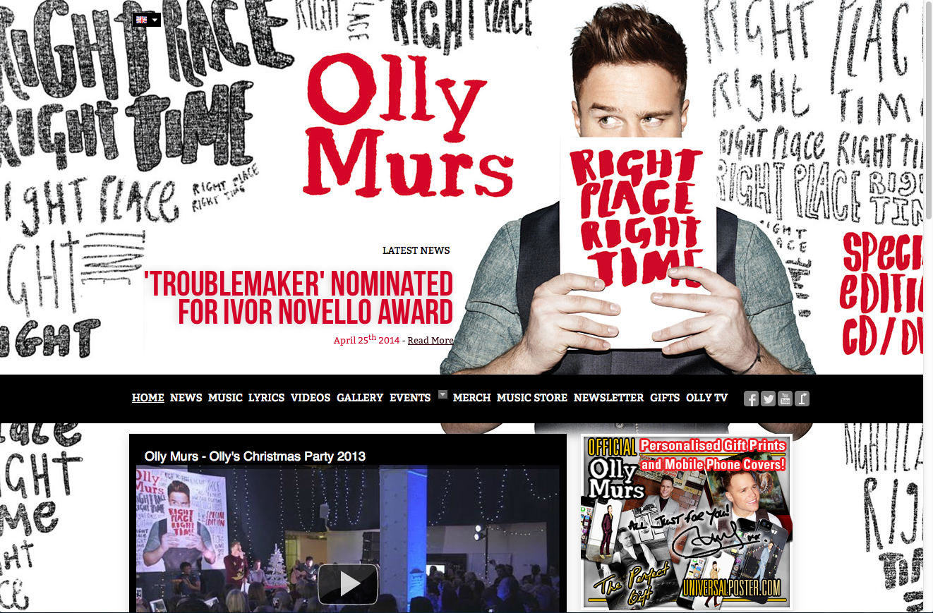
Task 2 (homework): Below are three screen shots from pages of the singer Olly Murs' website.

Analyse the images commenting on 

Visual codes
Mode of address
Representation
language used, 


Be sure to deal with the issues of convergence and interactivity within your answers.


Tuesday, 13 May 2014

Analysis of a website

Consider
Navigation bar, main information, menu, text to picture ratio, how the text is broken up, amount of graphics (this can make the page slow to load),

Font colour and size, how are hyperlinks arranged? Are they underlined?